Aurkibidea
Layout and elements of the Fillet web app
Understand app interfaces
Layout and elements of the Fillet web app
Learn about the layout of the Fillet web app and the different elements you can interact with.
Layout
Navigation bar
At the top of the screen is the navigation bar. It contains the Fillet brand logo, tab buttons, and navigation buttons such as "Documentation" and "Sign out".
Tabs
The Fillet web app has the following tabs:
- Ingredients
- Recipes
- Menu
- Vendors
- Labor
- Inventory
- Sync
These tabs are based on the types of objects that you can work with in Fillet: ingredients, recipes, menu items, vendors and activities.
To select a tab, click on it in the navigation bar.
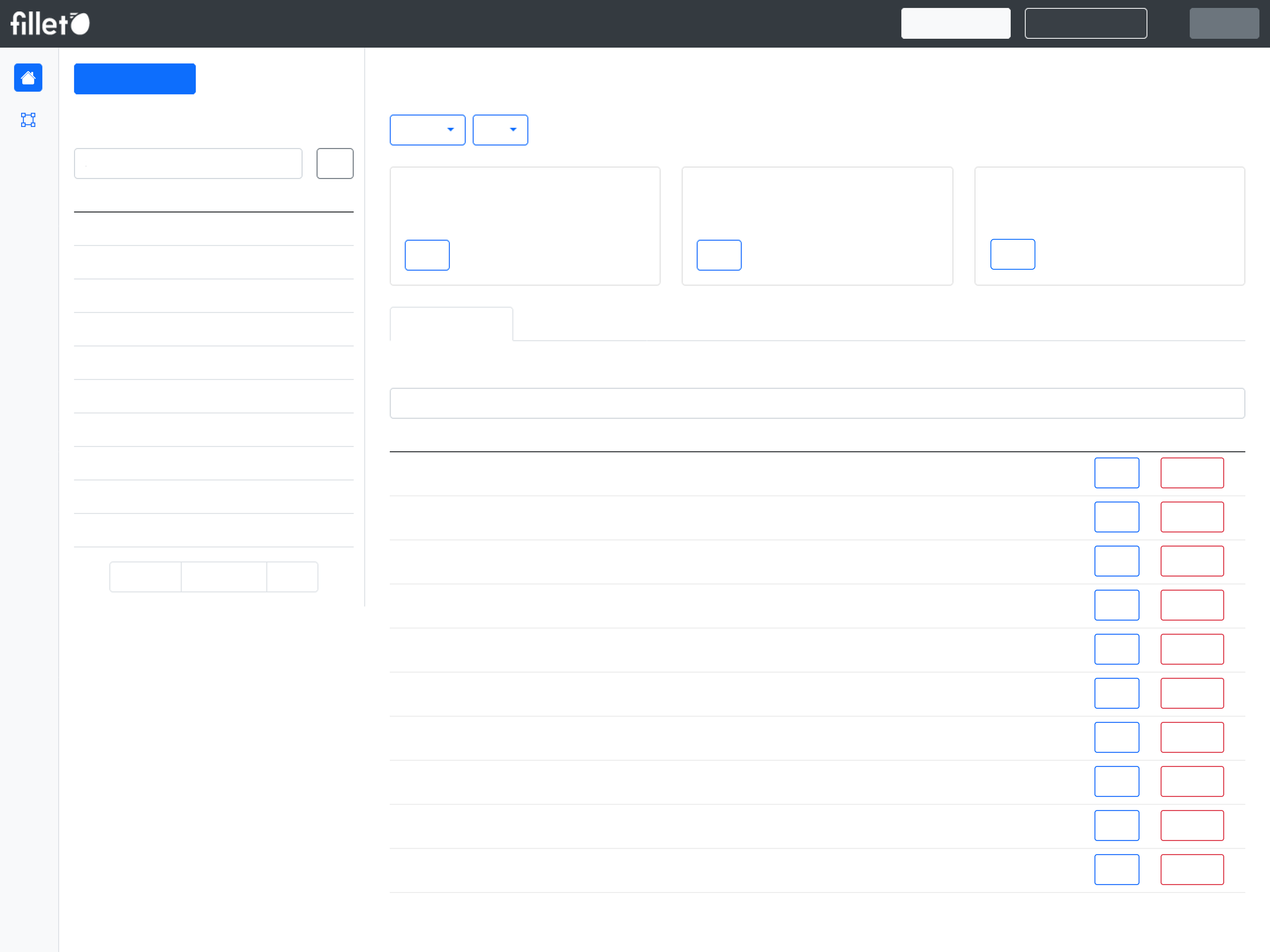
Views
Generally, each tab of the web app divided into these parts:
- List view
- Detail view
- Side panel New
On larger displays such as a desktop computer, the list view is shown as a sidebar and the detail view occupies the larger part of the screen.
For smaller displays such as smartphones, one of the two parts will be fullscreen, depending on which one is active. When you select a tab, the list view is fullscreen by default. When you select an object from the list, the detail view will be fullscreen.
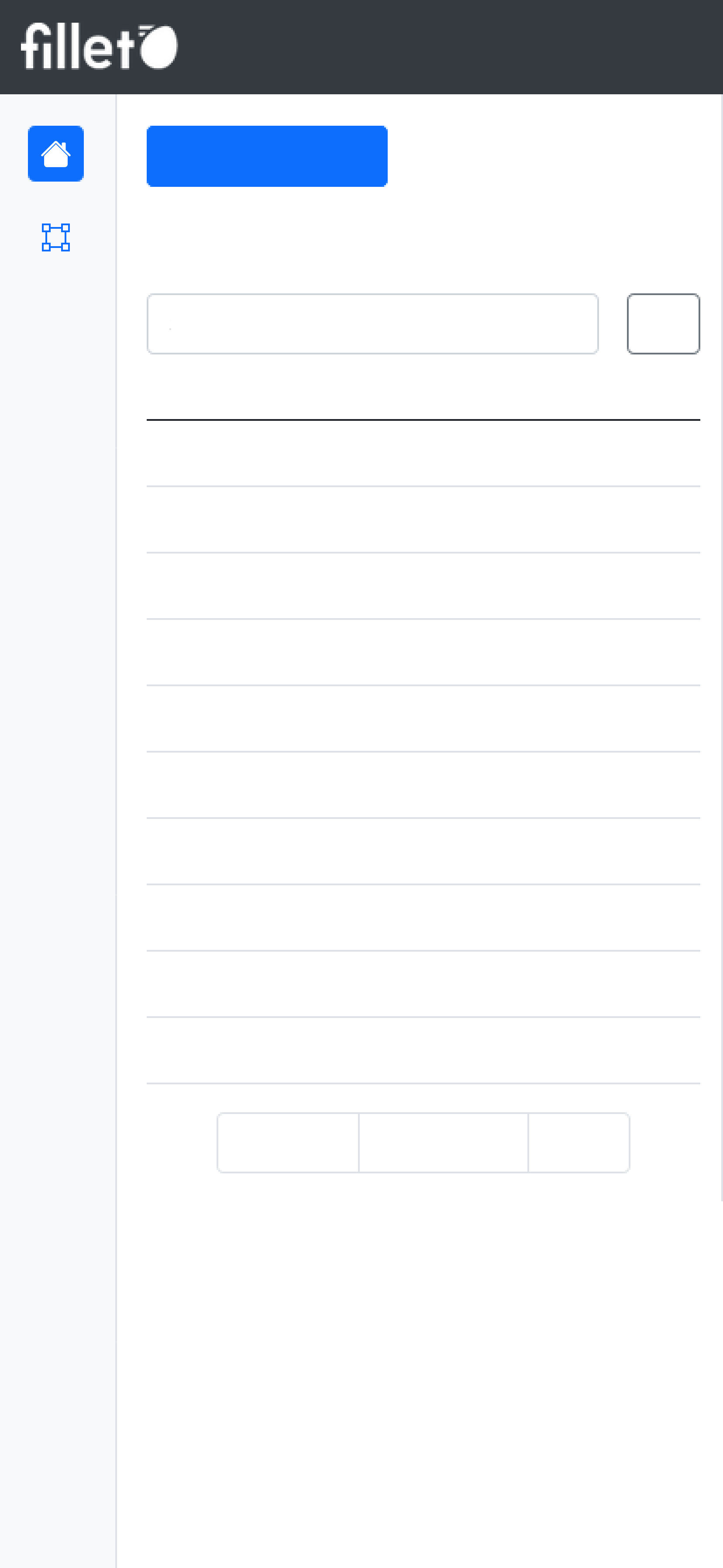
Mobile, list view
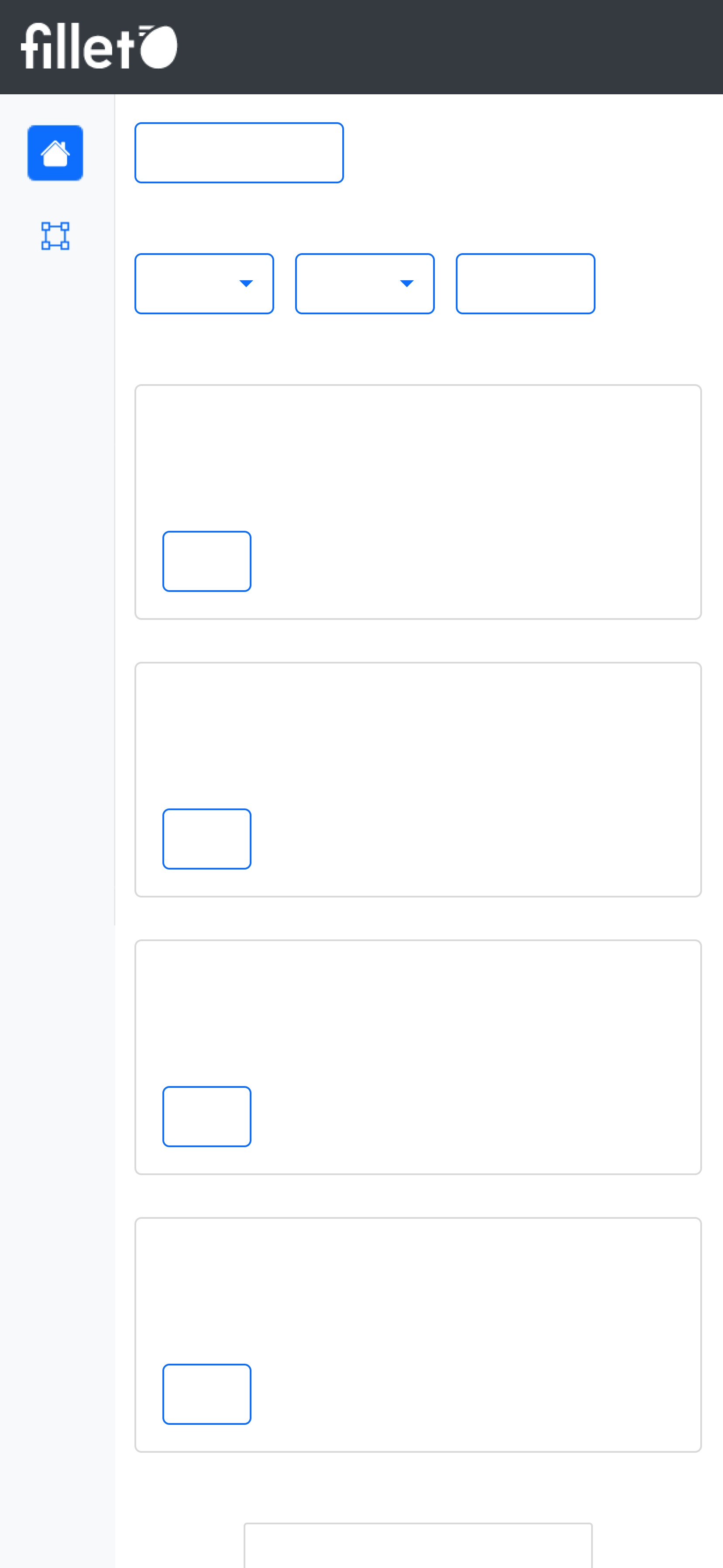
Mobile, detail view
List view
The list view generally has the following elements:
- Primary button
- List table
- Search bar for list table
Detail view
The detail view generally has the following elements:
- Widgets
- Detail section
- Detail table
- Search bar for list table
Side panel
In certain tabs, there is a side panel that you can use to navigate between different panels.
These panels are specific to the selected tab.
Elements
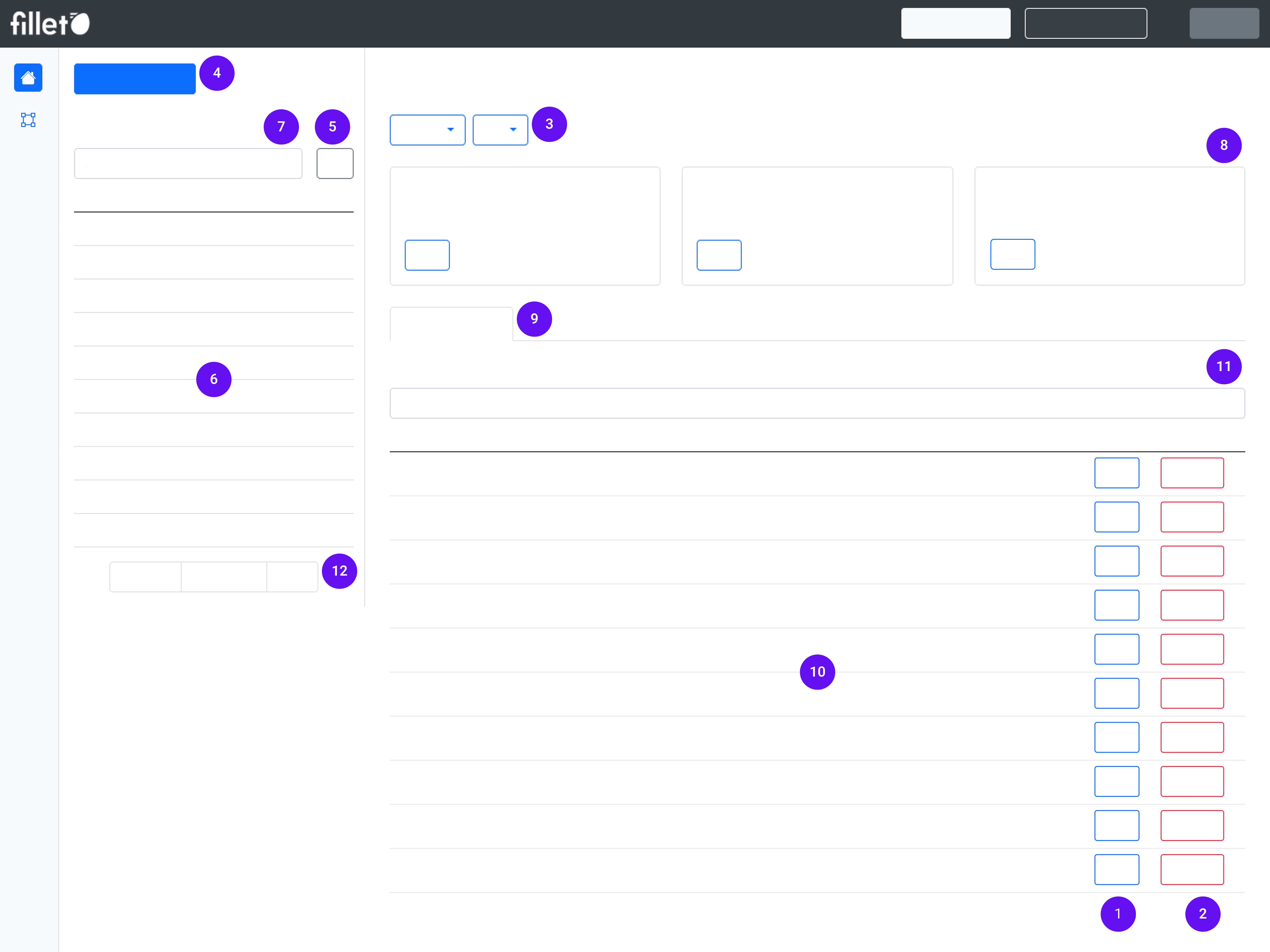
Each tab of the web app will have some combination of these elements:
- Basic button
- Danger button
- Dropdown button
- Primary button
- Options button
- List table
- Search bar for list table
- Widget
- Detail section
- Detail table
- Search bar for detail table
- Pagination
Definitions
Basic button
A standard button used to perform common actions in the app that don't need extra caution.
These buttons are either blue or grey.
Adibidea: Edit buttonDanger button
A button that shows you when an action needs extra caution.
They help you to know that you are about to make an important change, like deleting an object.
These buttons are always red.
Adibidea: Delete buttonDropdown button
A button that opens a menu of options when you select it.
They allow you to choose one of several actions from a list.
Adibidea: Actions buttonPrimary button
A bold button that is easy to see on the screen.
These are used for important tasks, like creating a new object.
These buttons are usually blue
Adibidea: In the Ingredients tab, the primary button is "Create ingredient".Options button
This button reveals additional actions you can take.
These buttons are usually grey.
Adibidea: Filter optionsList table
The table in the list view.
It displays a list of objects for the selected tab.
Adibidea:In the Ingredients tab, the list table shows all your ingredients: "All ingredients"
Search bar for list table
The search bar located above the list table.
It is used to search for names of objects in the list table.
Adibidea: In the Ingredients tab, search the "All ingredients" list to find ingredients by name.Widget
A card-like element that is focused on a specific topic or functionality.
It displays relevant information and provides topic-specific actions.
Adibidea: In the Ingredient's tab, the Edible Portion (EP) widget shows the EP percentage for the selected ingredient and includes a button to modify this setting.Detail section
Part of the detail view of the selected tab, usually located below the widgets.
Each tab has multiple sections, and each section is focused on a specific purpose.
It consists of various elements like detail tables, text boxes, and data visualizations.
Adibidea:In the main panel of the Ingredients tab, these are the available sections:
- Prices
- Unitate abstraktuak
- Notes
- Jatorrizko herrialdea
- Labels
- Groups
Detail table
A table that is part of a detail section.
There usually multiple detail tables in a selected tab, organized by section.
It displays information and provides options to edit or delete information.
Adibidea: In the Ingredients tab, the Prices section contains the Prices table. It displays all the prices for the selected ingredient.Search bar for detail table
The search bar located above a detail table.
It is used to search for names of objects in that detail table.
Adibidea: In the Ingredients tab, search the Prices table to find a vendor by namePagination
These are controls used to navigate through multiple pages of content.
It has buttons for Next and Previous to go forward and backward, as well as the number of pages.
It will be visible when a table has more than 10 rows.
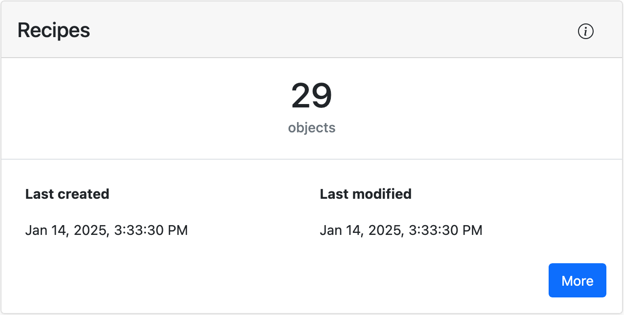
Dashboard
When you launch the Fillet web app, you will see the Dashboard.
It consists of different widgets that give you an overview of all the different objects and status updates.